Stock photos and images are good and effective assets to use in assistance with your branding, especially when done correctly but a lot of individuals tend to put themselves in trouble with peers and the law for incorrectly using them. To not run into these issues you can 1) when taking your own pictures (regarding other individuals’ face and property) get a written agreement from the person if you intending on using the image whether it’s for a commercial or personal project. And if you do get permission please don’t use the image in a slanderous way. 2)don’t just use random images from the internet. Use Royalty free images as this is a much safer way for you to not run into legal issues, sometimes you may be prompted to give credit to the owner the image, just do so with a smile as more opportunities will arise from this route than hurt your reputation.
The Use of Typefaces
Yes, you can run into uses from illegally using typefaces. A lot of individual whose use typeface think because it’s on the internet means that it’s free. This is not the case most of the time, as there are creators who take deep pride in the art of making typefaces and decide to therefore, charge it for what it’s worth. To avoid legal issues you could 1) pay for the font, if you really need to use it, why not support the artist for his work while you get the honors of using it? 2) Search for typefaces that are free for personal and commercial use (depending on the usage). Take the ISA typeface,” Activitc,” for example. Activitic is a free font on the web for personal and commercial uses, meaning I can also use this font in paid projects. By doing so I avoid all legal issues by searching for a free font.
crowdspring (2019). The Law on Fonts and Typefaces in Design and Marketing: Frequently Asked Questions (about commercial and non-commercial use). Available at https://www.crowdspring.com/blog/font-law-licensing/ (Accessed: 6th April, 2020)
In regards to the print based medium, the various assets that can be used in a screen based setting, can range from mockups of paper, posters, business cards and letterheads to digital files of logo assets, patterns, stock photos, images, icons and even typefaces.
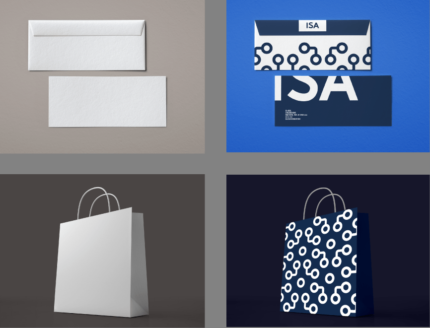
What is a mockup? A mockup is a full size model of an object or device etc that has not yet been built or created, showing how it will look or operated. These types of assets are usually 3D modeled in such a way that it be used for your desired usage. In relations to outcome 1 and 2, I used mockups to display the use of designs on various objects. like shown below
On the left are the renders and on the right are the designs placed on the renders and used as mockups.
The logo assets are usually the most important because logos are shown everywhere especially in various colours.
These are all logo assets that have been used in designs
Outcome 3&4 (Assets)
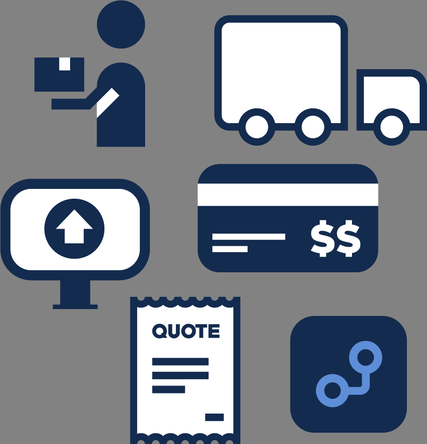
The types of assets that can be used in videos and apps are much more different than in print. In the digital space, there are digital assets that can be created by using your camera and taking pictures or created using softwares (this will be talked about further in the blog. Images and short video clips are common assets. Some of the assets used throughout the ISA app were icons.
These were the icons that were created for the ISA app.
Softwares & Hardwares
Softwares and hardwares go hand in hand, you can’t have softwares without hardwares and hardwares need softwares in order to finish the desired outcomes for this assignment. Softwares are a set of instructions data or programs, that tells a computer how to work while hardwares, refers to the physical parts of a computer and/or to related devices.
Outcome 1&2 (Softwares and Hardwares)
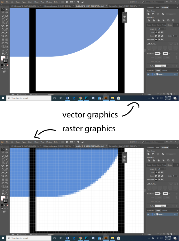
The softwares that were involved to create outcome 1 & 2 were Adobe Photoshop and Adobe Illustrator. Bare in mind as although these two softwares are similar, they both were created to serve different purpose. Adobe Photoshop was created to work with raster based graphics while Adobe Illustrator was created to deal with vector based images. In simpler terms, with Adobe Photoshop you can’t scale expoted files in sizes while with Adobe Illustrator you can.
difference between vector graphics and raster graphics
I used Adobe Illustrator to create to create the assets while I used Photoshop to apply them onto rendered images to creates mock ups for the outcomes. In terms of techniques used, one of the techniques I used was sketching out the logo and then scanning it with a scanner so that I can trace it over in Adobe Illustrator so I can get my digital asset. I use this technique mainly because I feel my ideas flow fluently when I put pencil to paper, then I use Illustrator for the final touch ups.
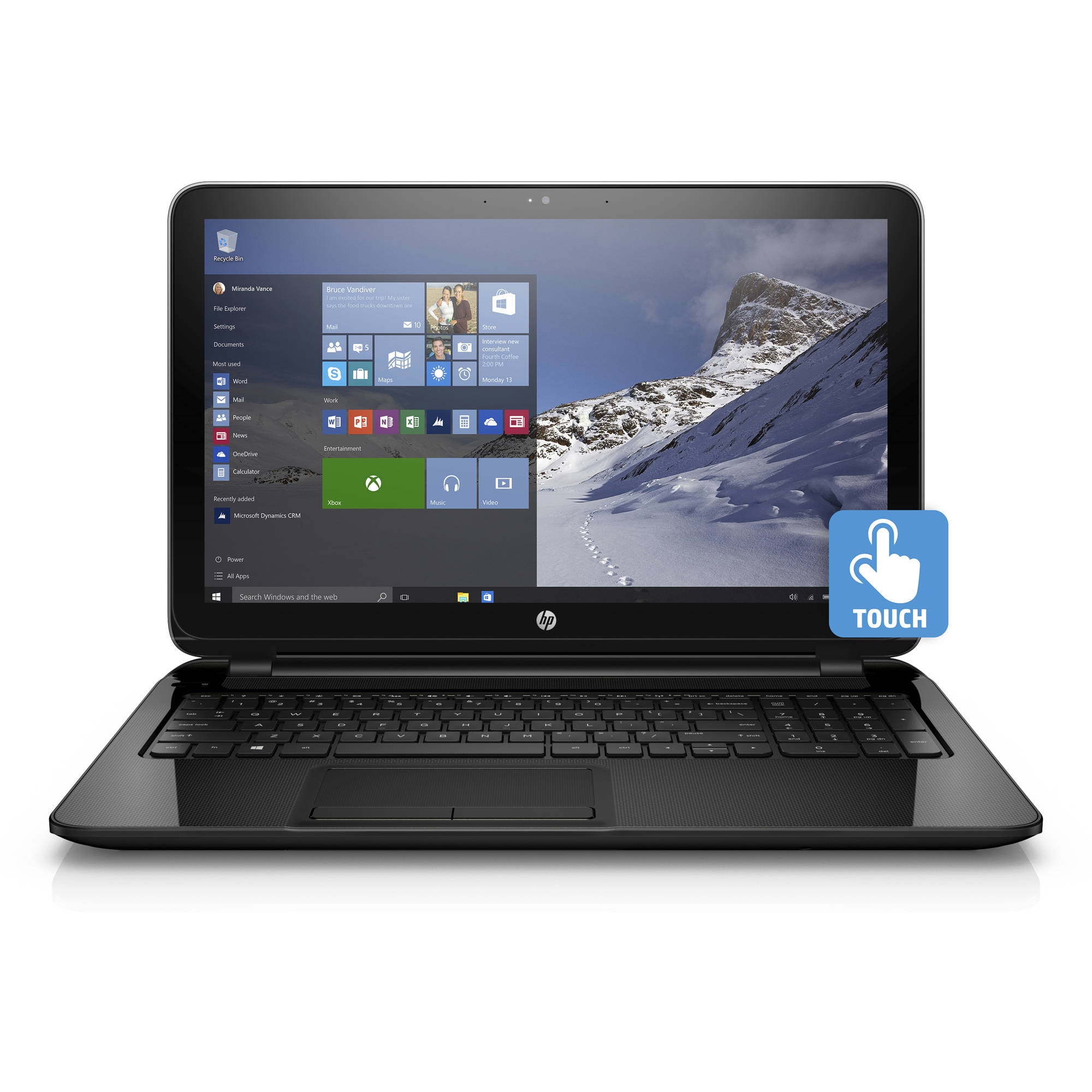
So the hardware used to create the outcomes 1&2 was the HP 15-f211wm Notebook PC. This PC contains a 2.16GHz Intel Celeron N2840 Processor with Turbo Boost Technology up to 2.58GHz Dual Core, it also has 4gb of memory and 500gb of storage. As far as hardware peripherals go, I only use the scanner as a method of quickly converting my physical sketches to digital drawings.
Model: HP 15-f211wm Notebook PC
Outcome 3&4 (Softwares and Hardwares)
Outcome 3&4 involved alot of different softwares and hardwares. Starting with Outcome 3 , the video commercial. The only software involved was Adobe Premiere Pro, which is a video editing software. The hardware used to edit it was an iMac computer. There were also three cameras used to create this video. The first part of the video, we shot it with a Canon EOS Rebel T5 with a 18-55mm lens, the camera comes with a 18 megapixel APS-C CMOS Sensor, a 3.0″ 460k-Dot LCD Monitor with DIGIC 4 Image Processor and a Full HD 1080p Video Recording at 30 fps. The second part was shot with my BLU S1 camera of 13 megapixels. The clips from this came out so crisp not only because of the good megapixel count but also the octa-core that it runs on in the hardware. The final part was shot on a Canon Rebel T1i with a 18-15mm lens, the camera comes with a 15.1- megapixel CMOS sensor with DIGIC four image processor, full HD video capture at 1920 x 1080 resolution; HDMI output and 3.0-inch Clear View LCD; Live View Function for stills (Quick, Live and Face Detection AF modes) and video. As far as hardware peripherals are concerned, only the iMac USB mouse and USB keyboard were used. I use the mouse to navigate myself around softwares while the keyboard was used mostly for the use of shortcut keys.
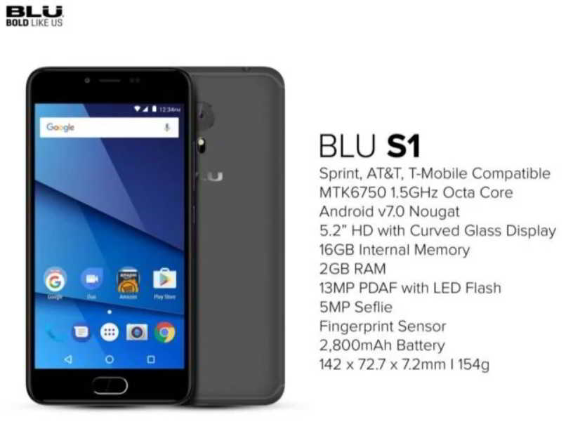
Images of a Canon T1i, Canon T5 and Blu S1 with specs.
With Outcome 4, the only software used to create the app was the Marvel App. To me, right now they are the best in helping you create good app prototypes for free.
Outcome 5 (Software and Hardware)
The softwares used to produce outcome 5( the radio ad) were applications that I could download from the playstore. I used an app called, sound recorder, to recorder my short radio ad, and another app called Music Editor, this app was used to edit the recording that I recorded. As far as hardware is concerned, for this recording I used my BLU S1 smartphone. The specs are listed in the image above this sub- topic.
So first I’m going to begin with, why create a radio? Well this goes back to diversifying the media that we will raise the awareness on. I chose a radio because when someone listens to the radio not often do they change what they’re listening to. They might not be paying attention sometimes but when you’re driving or sitting inside a maxi you either 1) can’t bother to change the radio unless the audio is really something you don’t want to listen or 2) when you’re in a maxi you’re afraid to ask the driver to change the channel. Now you’re stuck listening to something that you don’t really want to hear but in most cases your listening. This is where our radio ads will fall in.
I had some experience in creating a radio ad in a previous class. So I didn’t need any inspiration to search on the internet for to receive assistance. Using my knowledge from radio and drama classes. I wrote a short dialogue. During this time, my family and I were already in complete isolation due to the COVID-19 so I didn’t have access to their audio recorder, nor the assistance of peers (as this dialogue requires more than one voices). So with the assistance of my brother and sister, as well as the sound recorder built in to my phone. We knocked out this outcome with flying colours, of course we had to rehearse it a bit, but for me it was decent enough to call a radio ad.
Written Dialogue of radio ad.
Editing the Audio
Editing the audio was very difficult, at first I tried to download Audacity because those were the ones we used at school but for some reason my laptop wasn’t allowing me to download it. So I had try and download a free voice editing app on the google playstore(which is available for android users). It’s called Music Editor, it wasn’t the best, not even at a standard I can call good but it got the major stuff done. The major stuff I edited out was the excessive audio at the beginning and end as well adjust the audio gain.
Sound Recorder used to record audioThe Music Editor app was used to edit voice recording.
So first I’m going to begin with, why a develop an app? Well it started well I was browsing through the ISA website, just collecting more insight on what that business has to offer. I stumbled upon this very interesting concept. The concept of having an online printing service where you can send your documents and decide whether you want to pick up and pay or have it paid and delivered. To me that was the silver lining of the company and it was what separated them from the rest. My only issue was why just keep it to the website? I know a lot of individuals who own a laptop but I know even more who owns a smart phone. Just can you imagine receiving all of your printed material within the click of a button. The amount of time you will be saving on just that alone is extraordinary.
So in the beginning I was scrolling through Pinterest to see different layouts of an app because this was the first time I’ve been working on an app. I scrolled through a lot but what I stuck with in the end was the layout that they used on Whatsapp. Why? because it was very simple and manageable for me. I didn’t want to get hooked onto the fancy layout only to find out that I have no clue how to achieve the desired look. So I used the Whatsapp layout as inspiration.
UI of the Whatsapp app
After deciding to use Whatsapp’s User Interface as a template, I started ideating and sketching wireframes of the ISA app.
wireframe sketches of the ISA app
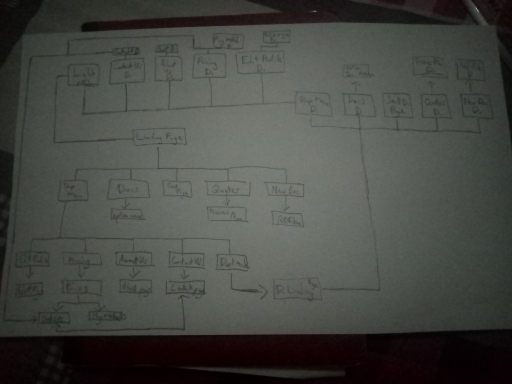
Afterwards I also created a hyperlink map to show how one layout is linked to another.
A map of hyperlinks
After doing this I opened the Adobe Illustrator software and started created images to use as the User Interface. Before You get confused I will explain it in my next round of texts.
A combination of all the files used to create the ISA app
After saving over 32 png files I uploaded them into an app called Marvel. Marvel is where the real magic happens. In marvel you are able to create any prototype apps without the knowledge of any form of coding. How it works is that you upload all the images you intend on using, create some hotspots. (Hotspots in other words are parts of the image that you can turn into hyperlinks which makes your frozen image into to now functional and clickable buttons. This makes your images comes to life as it functions as a developed app.
So first I’m going to begin with, why a video commercial? To me the purpose of a rebrand is to increase the awareness of a brand’s capabilities and there is two ways I personally think would make this as effective as possible. By either 1) doubling down on one medium or 2) you diversify the different media you intend on using.
Before I intially came up with my first script, I rewatched a bunch of content marketing video ads, some of which goes from the baby Mr Peanut to the nike inspirational documentry type ads. The idea was to create two video commercials, one which is sad and touchy which will connect with you. The other supposed to be action filled. So I did what any college student would do, I took a week and wrote up the first script with the idea of the theme in mind.
When I wrote the script, the thought process was more like a story/scenario playing out in my head. As it played out in my mind, I imagined the dialogue and I wrote. Fast forwarding to after finishing the script, I needed some actors for the job, so I gathered a few friends to discuss the first script (the sad themed script). After discussing the script, my friends didn’t understand the script at all. And I was left explaining it to them once again, and again until they finally understood it. It was then that they told me what was wrong with it. 1) It didn’t have any solid middle ground or ending, which is what left them confused 2) They needed a visual understanding of the script mainly because the script was the only thing I wrote up, I need create any storyboards which is what I should have done. After noting these problems I realized that this script needed more work. But instead of working longer on the same script, I decided to scrap that idea and go along with the idea of the second video which was much more fast paced. I wrote this script with the same process but with keeping the feedback from the last script in mind. I ensured that the middle and ending was very clear to them without the need for having a storyboard and that’s exactly what was done. I told them of this second script and they immediately got the gist of it.
These three images are the scrapped script that I gave up on trying to fix. Two images of the second script.
Shooting the video
So this video took three days to shoot and it took three cameras to complete it. The first half of the video was shot in school by Keli with her Canon EOS Rebel T5 camera. The middle scene, which was shot at the Dinsley Junction, was shot with a BLU S1, 13mp back camera with an octa core processor because at this time Keli left home with her camera and I was awaiting my response from the school for the use of their camera. Zackari assisted in shotting that footage. And on the final day, the rest of the footage was shot with a Canon Rebel T1 , by both Zackari and I.
Editing the video
I took a week and a half to complete the entire editing process. This was due to me getting ill, and I had to delay the work until my immune system was up to par. I started with arranging the clips, then making cuts to it, then adding in sound effect and assets and then finally colour grading it to blend everything well.
Colour and Mood both work hand in hand. They all tie back into the world of colour psychology. Colour Psychology is really the study of hues in relation to human behaviour. When creating a rebrand colour is very important because you are usually trying to send out a certain message. Let’s take a look at the colour red in various logos.
Red creates a feeling of passion, youthfulness,bold and excitement. In some other instances it causes feelings of danger.
Now looking into the colour psychology of green.
Green creates a feeling of being healthy, peaceful, growth and nature. This colour most of the time creates the feeling the what you’re doing is eco friendly.
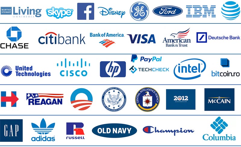
And lastly, Blue in colour psychology.
Blue creates a feeling of trust, dependability, strength and security.
Before I began sketching I did some research and different logos as well as create a board of inspiration for the the ISA Technology Rebrand.
Logos of companies I put together that involves technology.
Afterwards I did my research on the company as well as examine their current logo.
This was just a quick overview of what the business is and market research of who and what the business is for. Most of this knowledge came from me being a long time customers of theirs while other bits of information came from their website: https://www.isatechnology.com/store/Original Logo
The current logo is pretty clean and self explanatory. It’s made clear to me as a designer that it’s a business in the tech industry and it is known by the name ISA (as it’s in bold). Over the years, I generally don’t think anyone has a problem with it because of them being in business for so long. But where I see problems with it is that if this business chooses to expand, they will run into some usability problems with the logo.
Afterwards I started sketching on what that next problem could be.
I used mostly pen because I had this ideology that you should cement your ideas and not let them perish into the air because work without ideas is stagnant progress. I learnt this from a literature teacher in high school.
After sleeping on these sketches for a few day, upon realizing that none of them worked, I was reminded off a brainstorming technique which gave me clarity on what I needed to look for when carrying out these sketches.
This was a mindmap of thoughts that came to me when I thought of ISA ‘s tech and printing services.
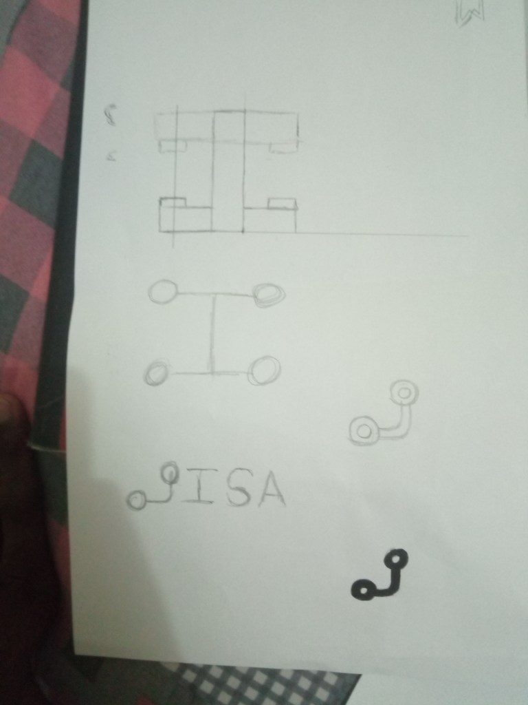
Below this is the immediate sketches that followed through while thinking which dots to connect (pun intended).
The last sketch was the concept that I ran with.The is the work that followed after settling on a concept. I go more indepth on some of it.
On the upper left side of the above images you can see I was testing out different typefaces, in which knowledge from the typography class became very handy. I settled in on the typeface, Activitic. The reason I chose this typeface was because it was bold (not too bold) also it has this modernistic, but also simplistic feel to it that felt suitable for the brand.
After adjusting some of the kerning. The ISA wordmark was finished. You can find this typeface on Joel Maillot’s behance at https://www.behance.net/maillot-joel.
After designing the logo I did some research on colours and meaning,(which you will see in another post).And these were the colours that were chosen.
Above is the two colours that were chosen along with the hex codes of both colours.
The first colour chosen, (similiar to sky blue whose hex code is #5D8ED7), was chosen because seemed to be most suitable for the rebrand, mainly because although I’m doing a rebrand I still want maintain some form of connection back to the original brand identity so it doesn’t result as a big shock to the consumers nor alienate the brand within its own industry. The second colour was chosen to analogize the second colour to give the brand a bit of contrast and create interest for it.
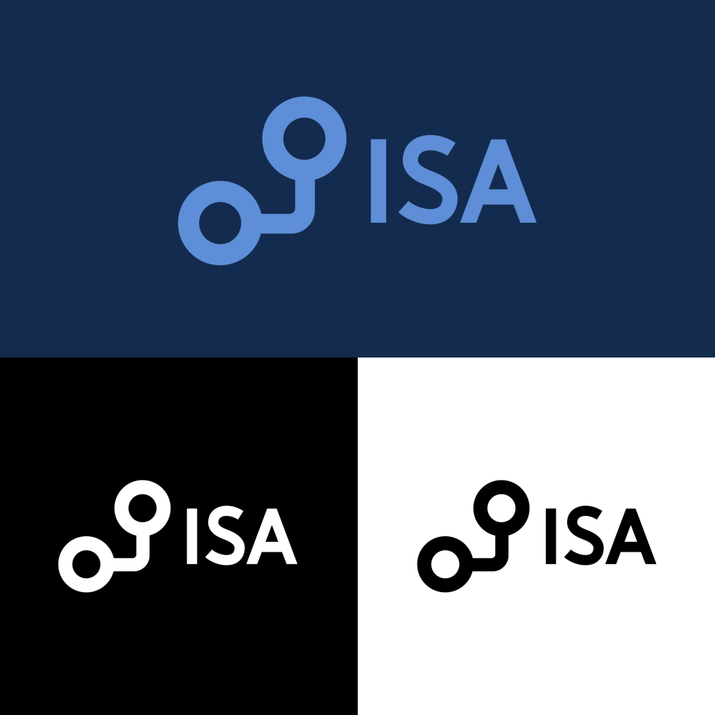
This is the design of the logo in colour and black and white.ISA main logo as colour variation animation.Meaning behind icon based on mindmap
Applications Of The Logo To Different Media
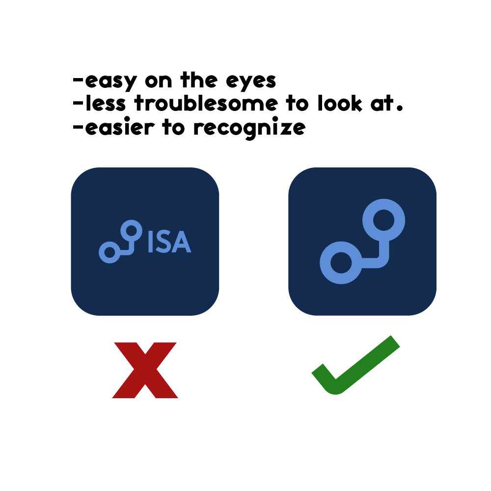
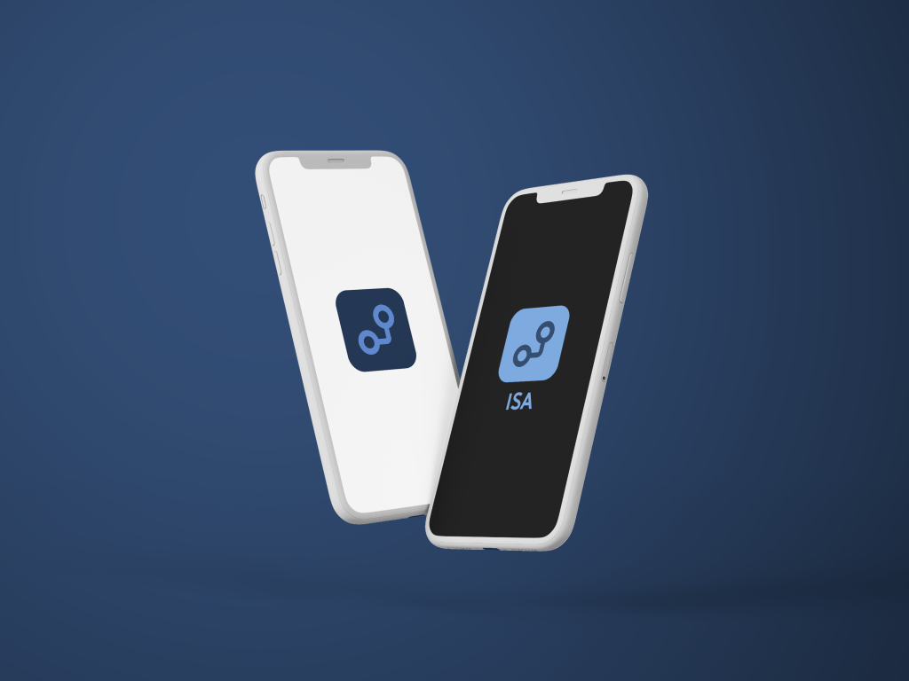
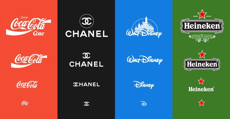
While designing the logo I realised that I would be used as their signage as well as their mobile app. The difference would be in the variation in size and what is understood. The smaller the medium, less would have to be shown due to our inability to comprehend detail at a small scale. The larger the medium, more would have to be shown otherwise we would miss out on the opportunity of having potential customers understand what we’re really all about.
This is why I created this Responsive design system.
This is to optimize the use of the logo so it can be adjusted to whatever medium it can be used. Simpler term, it increases the functionality of the logo.
Usage of the responsive logo in 2 out of 5 outcomes we had to do.
Outcome 1
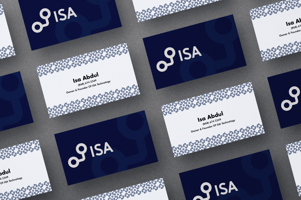
The following result decided in outcome 1 was thought out through the lenses of what the B2B clients will be more open to. Meaning that this is what they’ll see most of the time.
Mockup of ISA’s EnvelopeMockup of ISA Folders and LetterheadMockup of ISA Business CardsMockup of ISA app icon
Outcome 2
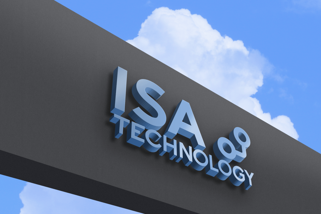
The following outcome 2 was thought out in the sense of what would be in front of the eyes of customers in the B2C business model space.
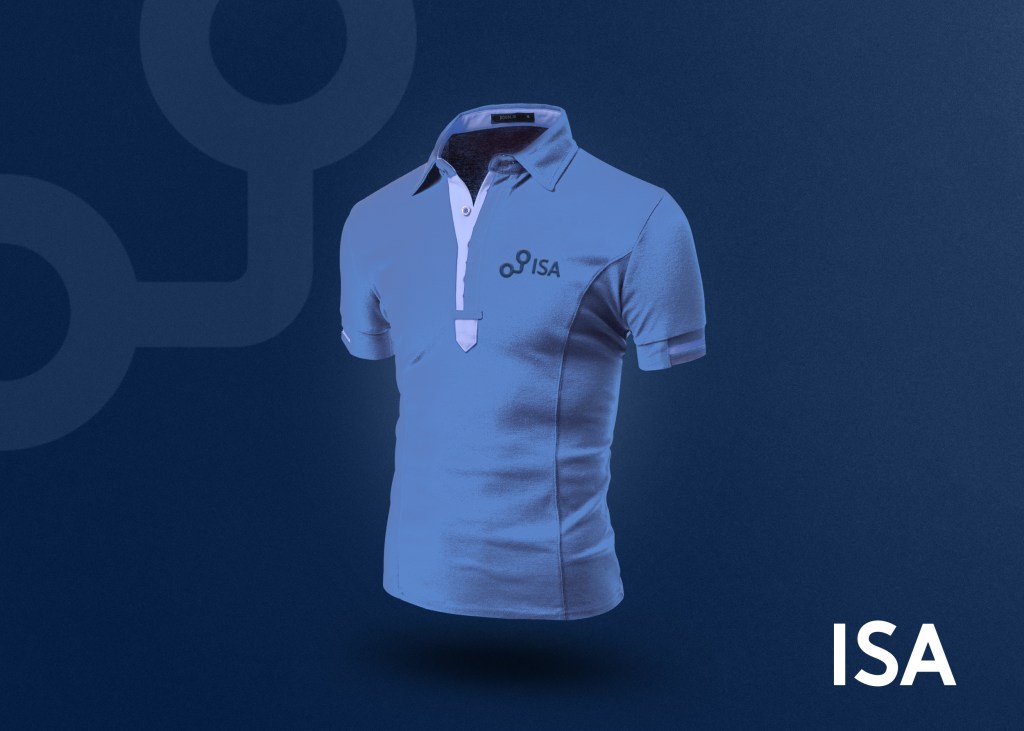
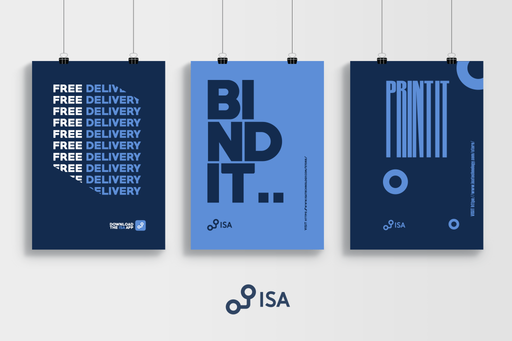
Mockup of ISA signage Mockup of ISA bag, this wil be given out to customers who make large purchases.Mockup of ISA employee polo shirts, all ISA employees will be required to wear one of these. Mockup of three ISA typographic posters.
Nintendo as we know it is one of the biggest video game companies we all know and love. But what we don’t know is the big transitions they have been making with their brand for the last 100 years.
This is nintendo’s logo in the 1950s , back then they used to sell playing cards and not video games mainly because video games weren’t even a thing yet.
From 1960 to 1965 they started using the wordmark nintendo in their own handwritten font.Later on after 1965, they designed the logo to be more legible by changing the type into a san serif typeface. From here until this very day only small iterations were made on the logo but it generally stays the same. Now this is Nintendo’s current logo in 2020.
Today in class we did a photo manipulation of anything.Images used to create manipulation.
Alright In class what we worked on was photo manipulation. What makes photo manipulation what it is, is not by simply placing images like a collage. But they have to blend well seamlessly so they seem apart of the image itself.
Here are a few photo manipulation advertisements I have done in the past.
Logo design have been evolving over the years and because of the constant change in technology, there is need for logos to adopt to the usability and aesthetics of the platform. The 3 trends are based on the observation of blogs from 99designs and digital synopsis, YouTube design gurus such as: Satori Graphics and Will Paterson as well as my own observations on what brands in and outside of Trinidad are doing with their logos.
1) Responsive Logos
Responsive Logos in 2020 is the standard for high end logo design. What makes these logos so trendy is its scalability. Because of this logos are able to be used across a vast amount of media effectively.
2) Gradient Logos
Gradient Logos are on the rise, due to the blend of colour they create and aesthetically pleasing touch to logo designs. Gradient logos were intially created to add depth and dimension but other flat two dimensional logos are adopting this principle to gather mass awareness and clout.
3) Hand Lettered Logos
Hand lettered Logos are so unique, they are not your typical fonts you can download on the web, but are custom designs specifically crafted for the client, hence why they are so trendy.