Before I began sketching I did some research and different logos as well as create a board of inspiration for the the ISA Technology Rebrand.

Afterwards I did my research on the company as well as examine their current logo.

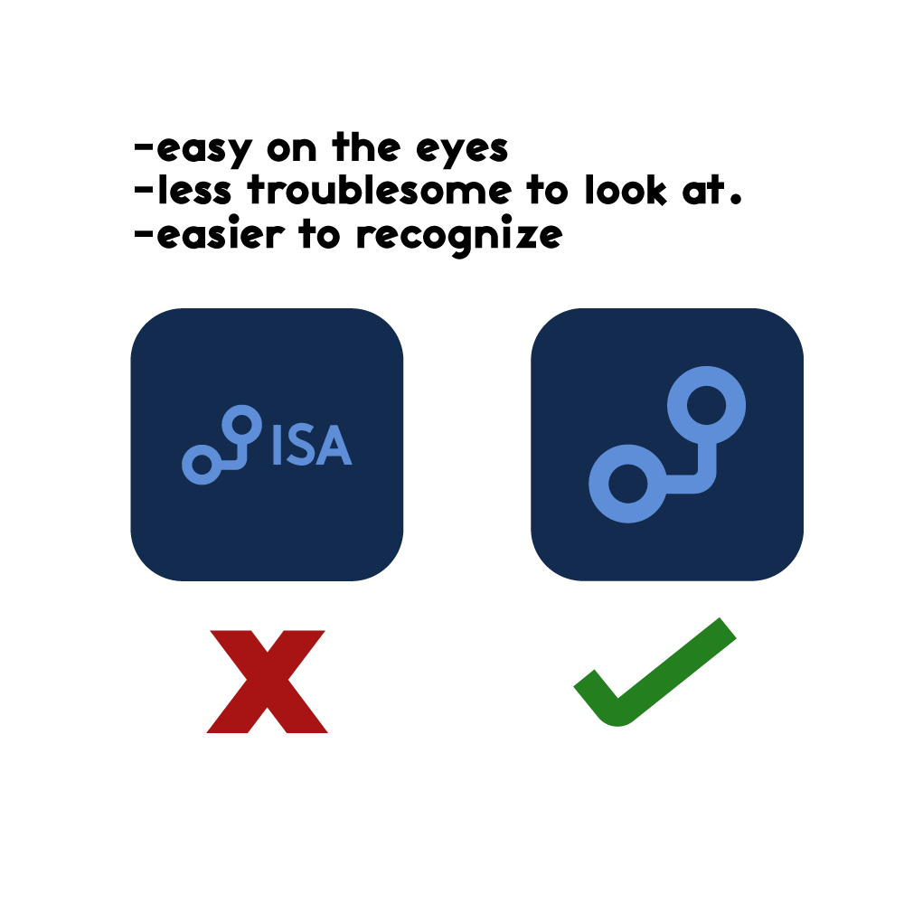
The current logo is pretty clean and self explanatory. It’s made clear to me as a designer that it’s a business in the tech industry and it is known by the name ISA (as it’s in bold). Over the years, I generally don’t think anyone has a problem with it because of them being in business for so long. But where I see problems with it is that if this business chooses to expand, they will run into some usability problems with the logo.
Afterwards I started sketching on what that next problem could be.

After sleeping on these sketches for a few day, upon realizing that none of them worked, I was reminded off a brainstorming technique which gave me clarity on what I needed to look for when carrying out these sketches.

Below this is the immediate sketches that followed through while thinking which dots to connect (pun intended).
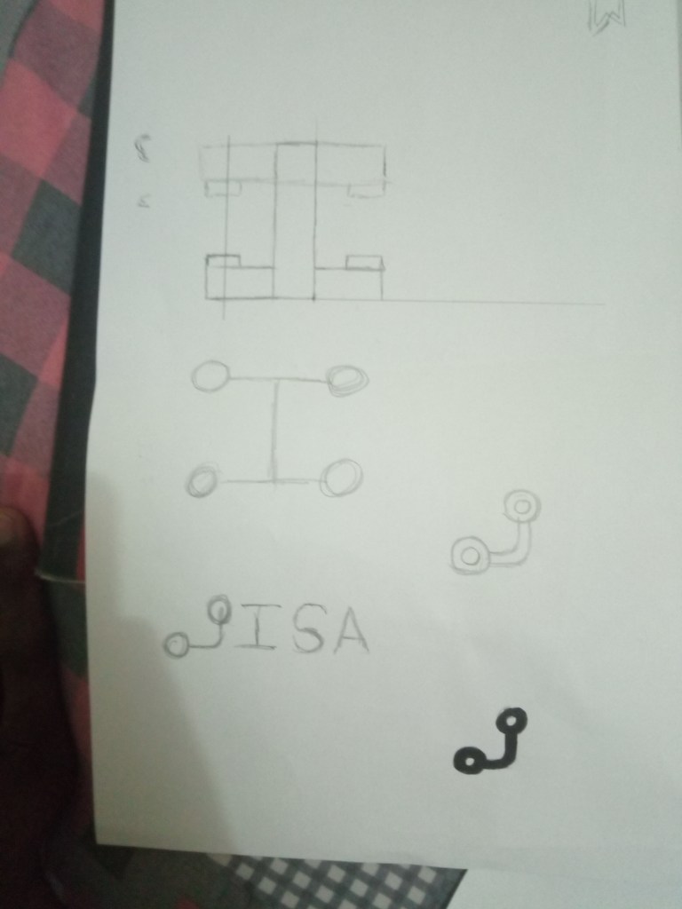

On the upper left side of the above images you can see I was testing out different typefaces, in which knowledge from the typography class became very handy. I settled in on the typeface, Activitic. The reason I chose this typeface was because it was bold (not too bold) also it has this modernistic, but also simplistic feel to it that felt suitable for the brand.

After designing the logo I did some research on colours and meaning,(which you will see in another post).And these were the colours that were chosen.

The first colour chosen, (similiar to sky blue whose hex code is #5D8ED7), was chosen because seemed to be most suitable for the rebrand, mainly because although I’m doing a rebrand I still want maintain some form of connection back to the original brand identity so it doesn’t result as a big shock to the consumers nor alienate the brand within its own industry. The second colour was chosen to analogize the second colour to give the brand a bit of contrast and create interest for it.


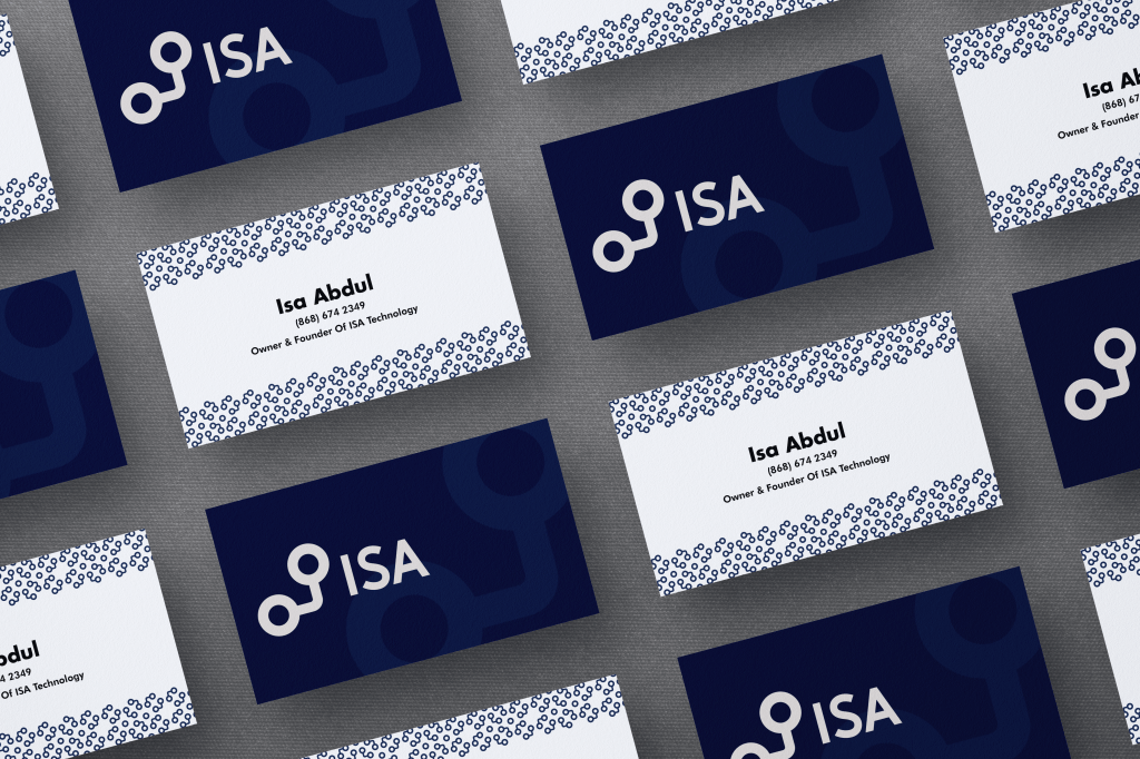
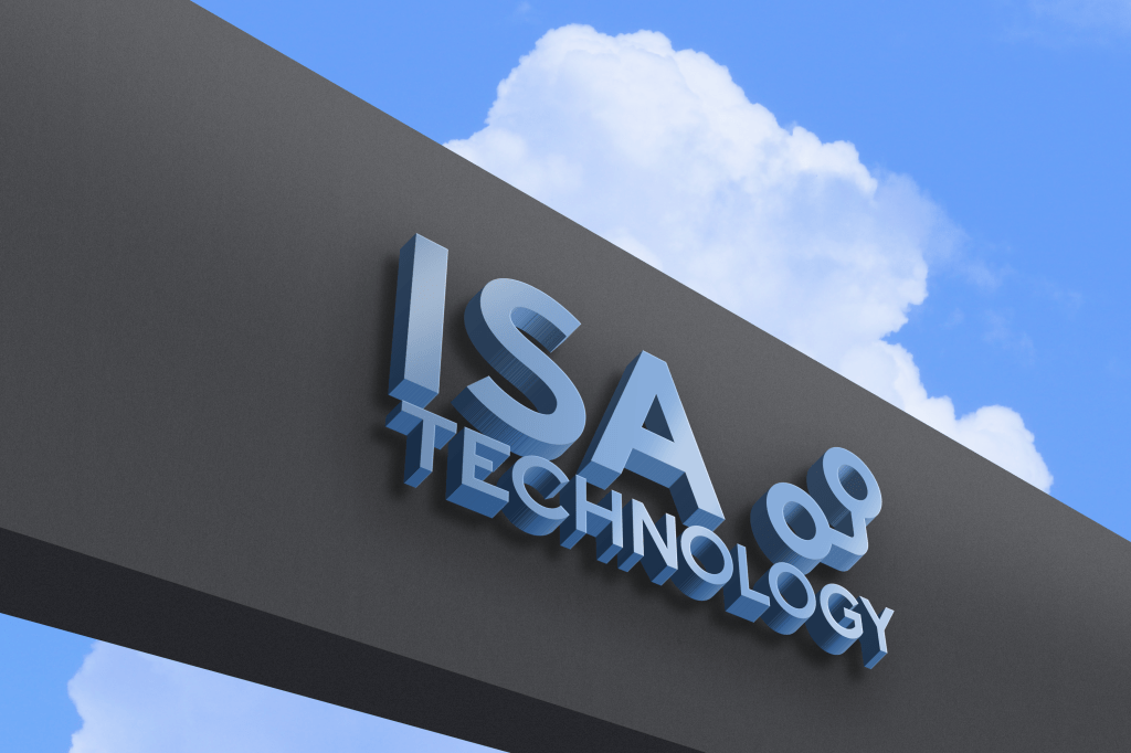
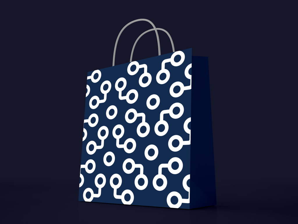
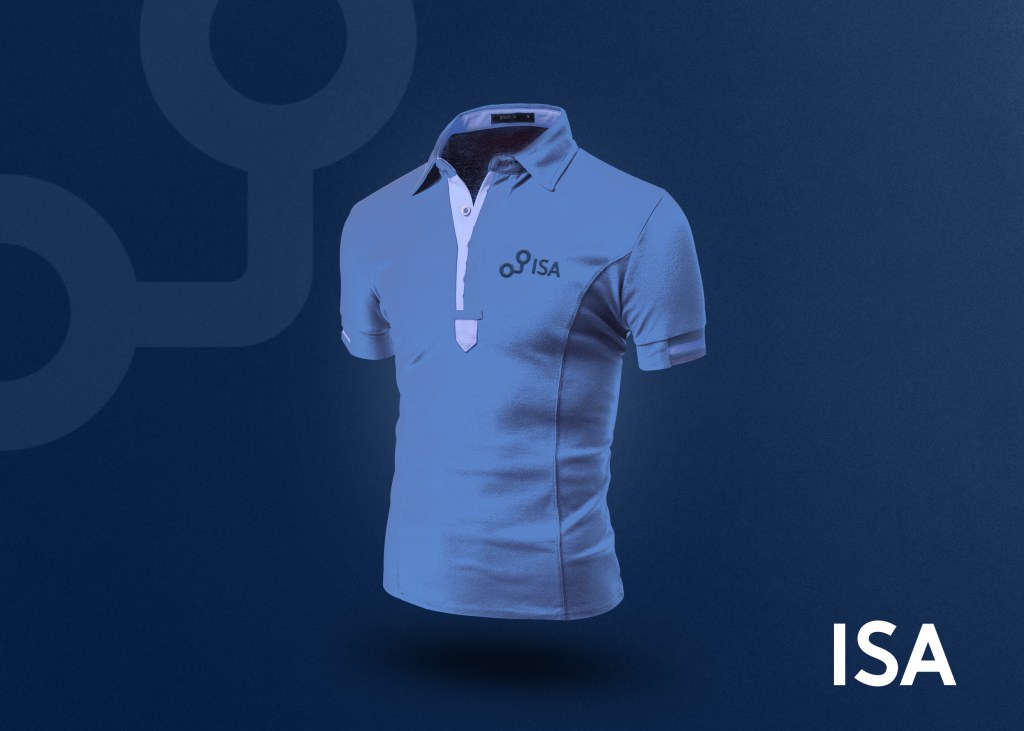
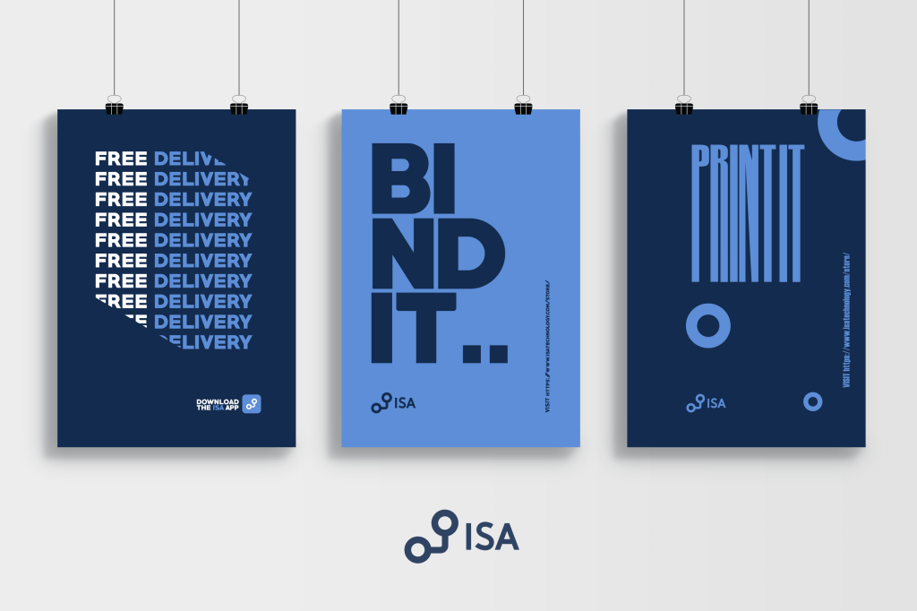
Applications Of The Logo To Different Media
While designing the logo I realised that I would be used as their signage as well as their mobile app. The difference would be in the variation in size and what is understood. The smaller the medium, less would have to be shown due to our inability to comprehend detail at a small scale. The larger the medium, more would have to be shown otherwise we would miss out on the opportunity of having potential customers understand what we’re really all about.
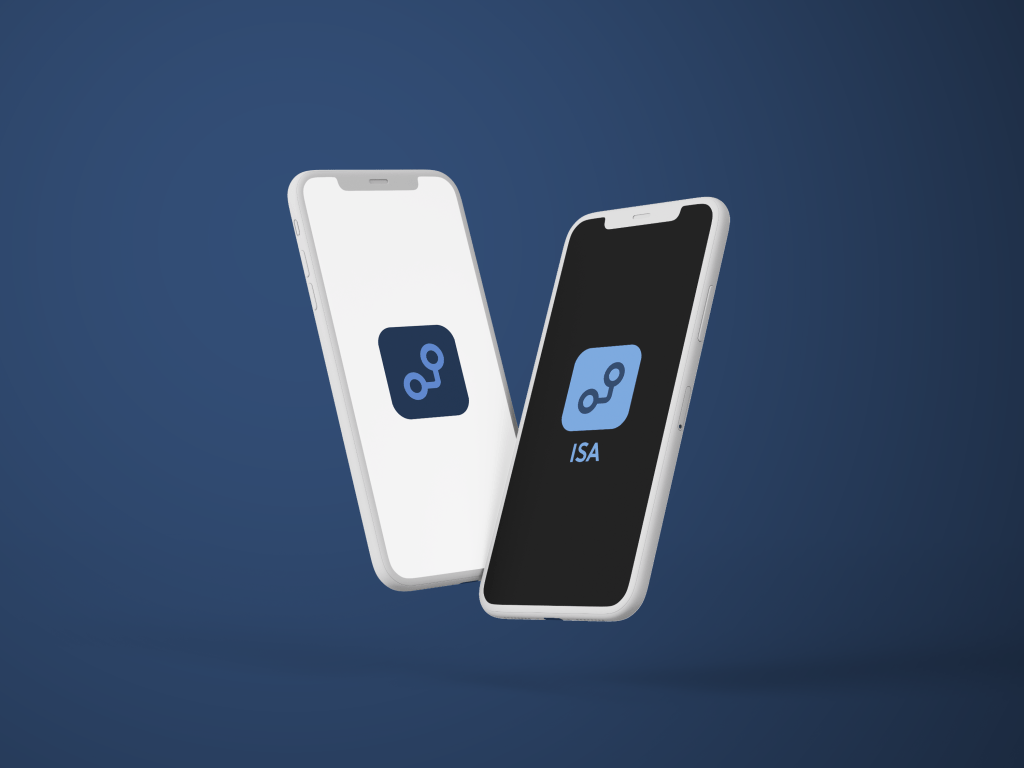
This is why I created this Responsive design system.

Usage of the responsive logo in 2 out of 5 outcomes we had to do.
Outcome 1
The following result decided in outcome 1 was thought out through the lenses of what the B2B clients will be more open to. Meaning that this is what they’ll see most of the time.


Outcome 2
The following outcome 2 was thought out in the sense of what would be in front of the eyes of customers in the B2C business model space.

References
https://www.behance.net/gallery/91696011/ACTIVITIC-FREE-SANS-SERIF-FONT
